
Designing user experiences for social media is not merely a matter of aesthetics or layout finesse. It demands a rigorous understanding of evolving user behaviors, psychological nuance, platform constraints, algorithmic dependencies, and business objectives that rarely align cleanly. What makes social media design uniquely difficult is the dual burden it places on UI and UX professionals; they must shape the experience for an audience that scrolls quickly, shares instinctively, and abandons platforms as fast as they adopt them.
Unlike e-commerce or productivity platforms, where flows are function-led and user intent is mostly transactional or task-oriented, social media exists as a complex blend of entertainment, identity-building, communication, and content consumption. This fluidity introduces structural ambiguity that designers are forced to tame without compromising emotional pull or technical clarity.
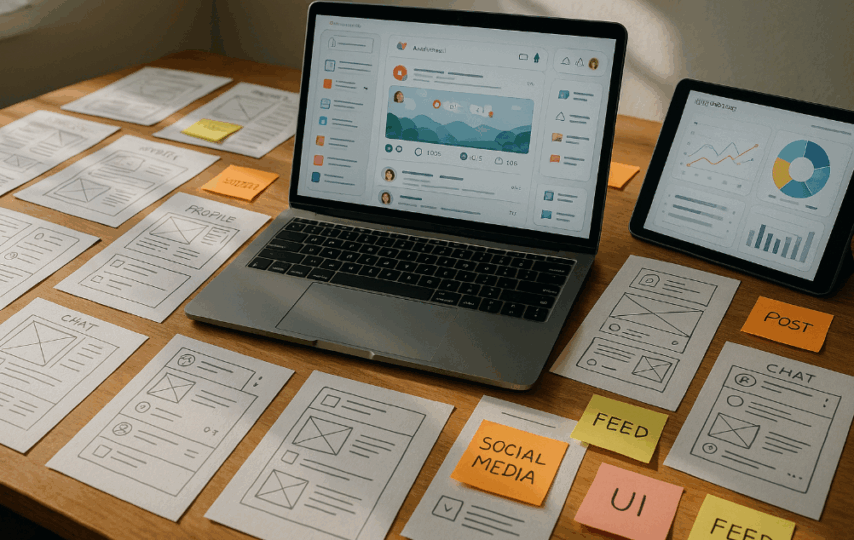
This blog explores the specific, real-world challenges faced by UI and UX designers when creating or optimizing social media products. For design leaders, product owners, and founders aiming to create compelling, sticky, and seamless platforms, this breakdown provides grounded insight into the work, the tension, and the design thinking that holds these fast-moving interfaces together.
Designing for Speed and Scroll Behavior Without Losing Structure
Social media users do not browse in a linear or patient manner. They skim, scroll, swipe, and exit in seconds. This behavior demands an interface that feels fast and constantly stimulating while still retaining a structure that guides action.
Balancing Visual Noise With Functional Clarity
To keep users engaged, designers often face pressure to fill screens with animations, media previews, reactions, polls, stickers, and trending content. This layered interface can quickly become overwhelming if not paced carefully.
Designers must decide what to reveal at each stage of interaction. Overloading the user with simultaneous options creates fatigue. Hiding critical features makes the experience feel shallow. Achieving the right pacing involves hierarchy, typography, and motion that support intuitive decision-making without visual chaos.
Prioritizing Content Without Diluting Navigation
Most social media platforms give content the spotlight. That places pressure on designers to push navigation away from the primary feed, often behind icons or gestures. While this maintains immersion, it complicates discoverability.
If core features like messaging, profile settings, saved posts, or creator tools become too difficult to find, engagement suffers. Designers must make these features accessible without stealing attention from content. This requires deep user journey mapping and micro-interactions that respect the feed-first model but still support platform functionality.
Maintaining Performance Without Compromising Design
Modern users expect instant load times, even when feeds are filled with high-resolution videos, carousels, and personalized elements. Heavy designs slow performance, especially on lower-end devices or in regions with limited connectivity.
Designers must optimize asset usage, delay non-critical loading, and collaborate closely with developers to test lightweight component behavior. Every gradient, icon, and font weight must be justified not only by aesthetics but by how it impacts the render pipeline.
Creating Interfaces That Work for Both Creators and Consumers
Social media platforms no longer serve passive users alone. They empower creators, influencers, and professionals who need access to insights, publishing tools, and analytics that do not disrupt the casual browsing experience for others.
Segmented UX Without Visual Fragmentation
Designers must accommodate different user types without creating two platforms within one. The creator tools, editing workflows, and scheduling options must coexist in the same design system as general features like feed consumption, story viewing, and commenting.
That requires modularity in UI components. The challenge lies in making advanced features available only when needed, while preserving a unified design language that does not feel disjointed or bifurcated.
Onboarding New Creators Without Cognitive Overload
Professional creators require dashboards, monetization settings, and branding tools. These features often live in hidden menus or separate views that feel confusing to first-time users.
Designers must craft onboarding flows that progressively reveal features, use language that aligns with industry familiarity, and avoid dumping too much information at once. This sequencing impacts retention. A cluttered dashboard or unlabelled control panel drives users back to simpler platforms.
Content Preview and Publishing Accuracy Across Surfaces
Creators need to understand how their posts will appear across formats—feeds, stories, reels, or community tabs. Designing preview tools that accurately represent final appearance across these channels is difficult, especially when each surface has different aspect ratios and character limits.
Designers must standardize UI cues that help creators preview, edit, and format content in real-time. If creators feel uncertain about how their content will display, they post less or abandon the platform altogether.
Maintaining Platform Identity Without Compromising Familiarity
Designing something that feels innovative but not alien is a central challenge in UI for social media. Platforms must stand out in a saturated market, but if they stray too far from learned behaviors, they face user resistance.
Platform Differentiation Without User Confusion
Each new platform attempts to differentiate itself with gestures, layouts, or novel interface patterns. But users have developed strong mental models from dominant apps like Instagram, TikTok, and Twitter. Any departure from these models must be carefully introduced.
Designers must explain new patterns through motion, feedback, and intuitive placement. Radical experimentation without signposting risks alienating the exact audience the platform seeks to grow.
Branding and Theme Without Distracting From Content
Platform identity matters. It builds user trust and retention. But if color palettes, type choices, or icon styles compete with user-generated content, the interface starts feeling heavy or artificial.
Designers must create an environment that supports content rather than overshadowing it. This involves neutral tones, flexible spacing, and subtle brand markers that reinforce identity without interrupting flow.
Interaction Models That Evolve With User Familiarity
Early users of a platform need clear guidance. Mature users need faster workflows. Designing for both means building interfaces that adapt. Tooltips, overlays, or micro-tutorials help early users. Gesture shortcuts or advanced settings serve veterans.
Designing with adaptive complexity—where the interface evolves with user engagement—requires data-driven thresholds, progressive disclosure, and interaction memory that keeps the system responsive to user behavior over time.
Designing for Emotion and Addiction Ethically
Social media interfaces are designed to be emotionally engaging. They trigger feedback loops, social validation, and reward mechanisms. But these same patterns can lead to overuse, distraction, and mental fatigue.
Feedback Systems That Feel Positive but Respectful
Reactions, likes, shares, and comments serve as feedback for users. But their visual design can feel manipulative if overdone. Designers must avoid making feedback too noisy or central.
Clean animations, limited color intensity, and placement that reinforces rather than interrupts help maintain emotional clarity. Feedback should feel informative, not addictive.
Notification Design That Encourages Return Without Creating Stress
Notifications bring users back to the app, but their design must be thoughtful. Badges, vibrations, and banners can cause anxiety if overused or poorly timed.
Designers must test notification frequency, display logic, and user control settings to avoid overwhelming the user. Personalization and opt-in mechanisms reduce pressure and build trust.
Screen Time Awareness and Exit Patterns
Some platforms now offer reminders or usage statistics. Designers can shape these tools into positive reinforcement rather than guilt-inducing metrics.
The interface should support natural exit points—scroll stops, completion messages, or time-based nudges—that allow users to disengage without feeling penalized.
Cross-Device Design Consistency and Complexity
Modern social media platforms must work seamlessly across phones, tablets, desktops, wearables, and sometimes even TVs. Designers must handle screen size shifts, input method changes, and platform-specific limitations.
Responsive Layouts With Contextual Logic
It is not enough to resize elements. The interface must adapt to how users behave differently on each device. Swipe behavior makes sense on phones, while hover states apply to desktops. Voice commands may enter on smart devices.
Designers must map these context shifts without breaking the core experience. That demands modular components, flexible grids, and interaction logic that degrades or upgrades based on device capability.
Synchronization of States Across Devices
If a user likes a post on their tablet, the same post must reflect that on their phone seconds later. State consistency is a UX expectation that breaks when synchronization fails.
A top app development company knows the importance of multi-device compatibility. ensure an efficient user experience across every device, its skilled back-end team defines how application state is cached, updated, and reflected in real-time across platforms. This is invisible work, but its absence creates visible frustration.
Accessibility Standards Across All Experiences
Designers must ensure that every platform experience meets accessibility requirements. This includes contrast ratios, screen reader support, touch target sizes, and motion sensitivity options.
Cross-device accessibility means testing across different OS standards, hardware generations, and assistive technologies. It is complex, but non-negotiable.
In Conclusion
UI and UX design for social media presents a deeply demanding challenge. It pushes designers to balance visual delight with usability, performance with identity, flexibility with clarity, and engagement with ethics. Unlike other platforms, social media is both a tool and an environment. That duality makes design decisions carry enormous weight across emotional, social, and technical dimensions.
Developers and designers who succeed in this field are not just visual thinkers. They are systems architects, behavior analysts, interaction planners, and cultural translators. They know how to listen to users without becoming reactive. They innovate without alienating. They build for speed without creating clutter. That blend of sensitivity and precision is what distinguishes those who work on social interfaces at scale.If you are aiming to create a platform that feels native, fast, personal, and purposeful, it makes sense to partner with a social media app development company. Consider collaborating with the resource who understands the real design tensions behind the feed, the swipe, the tap, and the loop, along with the tech.